As somebody who's spent 2 years studying graphic design and 3 years studying design in general, I could speak on this for hours - but I won't!
Let's to the main points; before around 2010, pretty much every company favoured skeuomorphic design, skeuomorphic design is when a logo or an icon looks like the real object. Remember when the YouTube app on your iPhone looked like a tv? Or when the camera icon looked like a camera lens? Or when the newsstand app looked like a newsstand?
Whether skeuomorphic design is good for us and if it will stick are both controversial topics within the design industry. Some think that we should aim to create digital assets that still represent real objects and others, like me, think that flat minimalist design is the way forward and that staying with skeuomorphic design is unnecessarily clinging to the past. In the digital age, everything is always changing, designers have more to do and need to work quicker; skeuomorphic design is in no way quick.
Before we dive into the car manufacturers logos, let's take a look at some more obvious examples of changing to flat design:
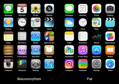
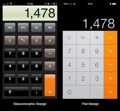
Examples of Apple making the change can be seen in their computer operating system MacOS and, their mobile operating system, iOS. They were among the first to make the jump to flat design.
Enough of the geeky design stuff. Lets get to the car manufacturers.
BMW
Amazingly, BMW's logo has remained largely unchanged since 1917, it's only been slightly tweaked over the last one hundred or so years. The BMW logo represents the Bavarian flag, which is where BMW was founded.
The latest tweak to the BMW logo might just be the most significant change in the history of the brand.
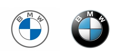
KIA
Kia is heading upmarket. The Kia logo has changed a total of 6 times since 1944 - 4 of those changes were drastic changes. Hopefully, Kia stays with this flat upmarket design. It's much better! Although judging by their eventful logo history, in 20 years it could be completely different.
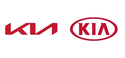
Nissan
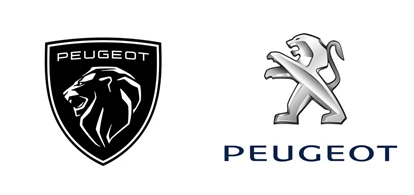
The famous Nissan logo has remained largely unchanged since 1990. Much like Peugeot, their recent redesign has moved towards a flatter and much sportier feel. This might give us some sort of idea as to what is to come from Nissan's cars, hopefully, their cars go in the same direction as their logo!
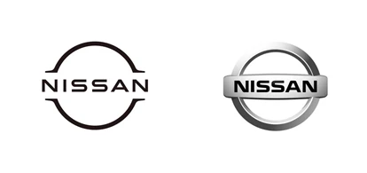
Toyota
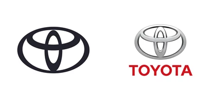
Not only has Toyota opted for a flattening of their logo, but they've also abandoned the wordmark. Toyota is among the few brands in the world that has a logo that's noticeable enough to drop the wordmark. This elite club of companies that can drop the wordmark from their logo consists of McDonald's, Apple, Starbucks, Instagram, Nike and a couple of car manufacturers.
Bravo, Toyota. If it isn't broken, don't fix it; just modernise it.
Volkswagen
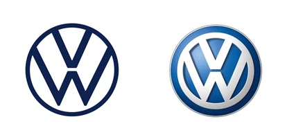
Volkswagen's logo has stayed pretty much the same since 1937 and is another car manufacturer that is part of that elite club of brands that can drop all wording from their logo and still be instantly recognisable anywhere in the world. Thanks to their wildly successful Golf, Beetle and Type 2 models, Volkswagen has cemented their iconic logo in the minds of hundreds of millions of people all over the world.
Volkswagen's new flat logo design lends itself well to the new ID range.
Audi
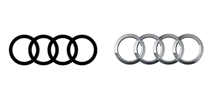
I might be a little bit bias here; I like Audi. I drive an Audi and, my next car will likely be an Audi. Opinions aside, Audi is another manufacturer that in 2016 dropped the wording from their logo and went for a flat minimalist design.
The four rings first appeared in 1932 and have been a staple of Audi's branding since 1932, aside from a brief stint in the 1970s when Audi opted for a text-based logo. Audi has always appeared slightly more modern than their competitor, this logo flattening continues that trend.
